The story behind the image on Indian 20 rupee note
I once wrote about the scenery on the back of the Indian 20-rupee note because it caught my eye during a quiet moment in a local chai stall. That post vanished, but the curiosity stayed.
Every time I pull out a 20-rupee note now—the bright, modern yellow one or the faded orange version—I wonder about the landscapes carved into its reverse side. What story does the Reserve Bank of India want us to carry in our pockets?
Let me retrace that path for you. It is a look at how India represents itself through the paper and ink we use every day.
The old ₹20 note: A view from the Andamans
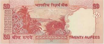
If you remember the older, reddish-orange ₹20 note, you might recall the scenic bay lined with lush palm trees. It wasn’t just a generic tropical sketch. That image was a direct capture of North Bay Island in the Andaman and Nicobar archipelago.
It’s a view you could—and still can—experience on the way to Mount Harriet, the second-highest peak in the Andaman islands. It was a choice that brought the quiet, distant beauty of our islands into the hands of people across the country.
For a long time, that red-tinted note was a travel invitation, even if most people never realized exactly where they were looking.
The new ₹20 note: The eternal stone of Ellora
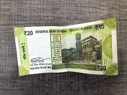
When the Reserve Bank of India introduced the new, compact, greenish-yellow ₹20 note in 2019, the landscape changed entirely. Flip this one over, and you see the Ellora Caves—specifically, the iconic Kailash Temple.
This UNESCO World Heritage site in Maharashtra is a miracle of ancient engineering. Carved top-down from a single basalt cliff between the 8th and 10th centuries, the Kailash Temple is a masterpiece of rock-cut architecture.
By placing it on the note, the RBI moved from a landscape of nature to a landscape of human devotion and skill. It is a symbol that ties India’s cultural heritage directly into our everyday economy.
Why this shift matters
The change from the Andaman landscape to the Ellora motif wasn’t random. It reflects a shift in how India’s currency communicates our identity. In the New Series (issued from 2016 onwards), each note became a showcase for national heritage: Konark on the ₹10, Hampi on the ₹50, and the Red Fort on the ₹500.
While the old Andaman note felt like a quiet discovery of nature, the new Ellora note feels like an appreciation of history. Both, however, serve the same purpose: they remind us that the money in our wallets is linked to places that exist beyond our screens and city limits.
A personal reflection
Holding these two notes side-by-side, I feel the weight of time. The old one carries the stories of an older, pre-digital India. The new one fits our modern, compact world, but it whispers of ancient chisels shaping eternity from solid rock.
In a world of QR codes and digital wallets, these physical notes are tactile history lessons. We don’t often stop to look at the reverse side of our money, but perhaps we should.
Ellora wasn’t built for a banknote; it was built to endure. The RBI put it there to remind us that India’s story is layered, carved deep, and worth carrying forward.
Next time you pay for a small purchase, pause for a second. That ₹20 isn’t just change. It is a portal to our islands and our ancient temples, and a small, quiet poetry of India that travels with you everywhere.
For the collectors: Keep an eye on those watermarks and print years. While the new greenish-yellow notes dominate circulation, the old orange ones are still a piece of history worth holding onto. The note changes, but the heritage they represent is exactly where it has always been.
Thank you. Your comment will appear here once Nilabh has read it, usually within a few days.
That didn’t go through. Please check your name, email and comment and try again, or write to nilabh@travelescape.in.
Comments
Start the conversation.
Every comment is read before it appears here. Your email address is never shown; you get one email when your comment is up.